
So the original template/layout I was using for my weekly Project 365 photos wasn't working for me anymore. I'm not even sure why I started to not like them, but I wanted a "cleaner" look I think. So I redid all of my weekly ones and I think I'm much happier with this format. What do you think?
I think I'll change out the color of the background with each new month, but I haven't decided for sure yet.
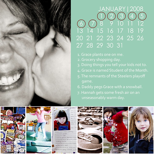
Week #1
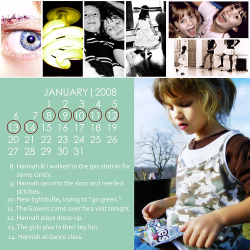
Week #2
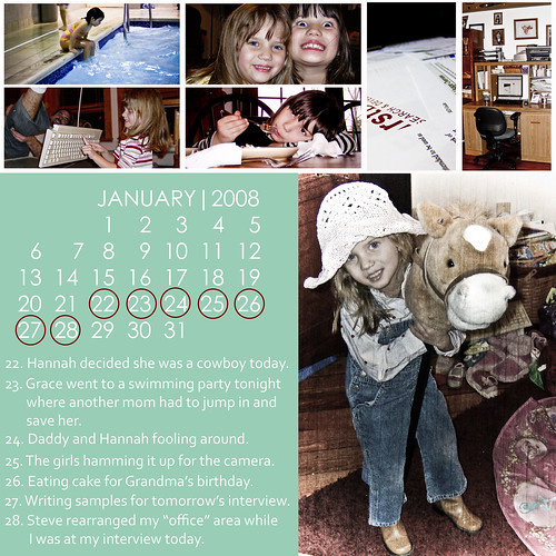
Week #3

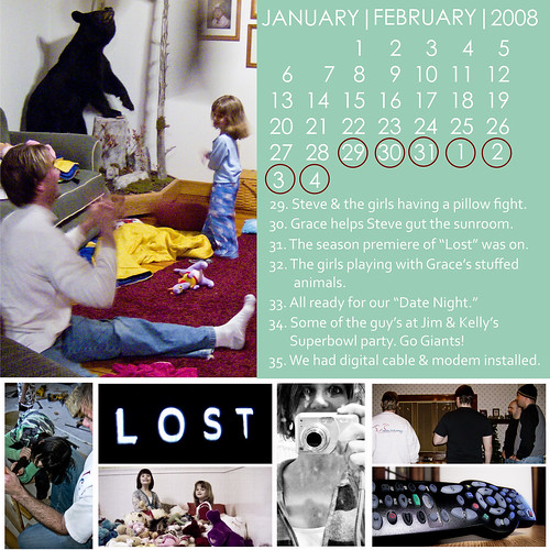
Week #4
Love it, love it, LOVE IT! Great weekly recap!
ReplyDeleteI think that looks much better!
ReplyDeleteI LOVE that. It looks really clean, and for slight variety through the year you could use different colors by month.
ReplyDeleteI LOVE that - awesome!
ReplyDelete